感谢阮一峰老师的教程http://www.ruanyifeng.com/blog/2015/07/flex-grammar.html
本示例在网友JailBreak所做的Demo的基础上将教程上所有的布局都简单的实现了一遍
并保存在github上面https://github.com/brushbird/flex-demo
flex-direction属性决定主轴的方向(即项目的排列方向)。
.box { flex-direction: row | row-reverse | column | column-reverse; }
默认情况下,项目都排在一条线(又称"轴线")上。flex-wrap属性定义,如果一条轴线排不下,如何换行。
.box{ flex-wrap: nowrap | wrap | wrap-reverse; }
nowrap(默认):不换行。
wrap:换行,第一行在上方。
wrap-reverse:换行,第一行在下方。
flex-flow属性是flex-direction属性和flex-wrap属性的简写形式,默认值为row nowrap。
.box { flex-flow: <flex-direction> || <flex-wrap>; }
justify-content属性定义了项目在主轴上的对齐方式。
.box { justify-content: flex-start | flex-end | center | space-between | space-around; }
flex-start(默认值):左对齐
flex-end:右对齐
center: 居中
space-between:两端对齐,项目之间的间隔都相等。
space-around:每个项目两侧的间隔相等。所以,项目之间的间隔比项目与边框的间隔大一倍。
align-items属性定义项目在交叉轴上如何对齐。
.box { align-items: flex-start | flex-end | center | baseline | stretch; }
flex-start:交叉轴的起点对齐。
flex-end:交叉轴的终点对齐。
center:交叉轴的中点对齐。
baseline: 项目的第一行文字的基线对齐。
stretch(默认值):如果项目未设置高度或设为auto,将占满整个容器的高度。
align-content属性定义了多根轴线(多行)的对齐方式。如果项目只有一根轴线,该属性不起作用。
.box { align-content: flex-start | flex-end | center | space-between | space-around | stretch; }
flex-start:交叉轴的起点对齐。
flex-end:与交叉轴的终点对齐。
center:与交叉轴的中点对齐。
space-between:与交叉轴两端对齐,轴线之间的间隔平均分布。
space-around:每根轴线两侧的间隔都相等。所以,轴线之间的间隔比轴线与边框的间隔大一倍。
stretch(默认值):轴线占满整个交叉轴。
order属性定义项目的排列顺序。数值越小,排列越靠前,默认为0。
.item { order: <integer>; }
flex-grow属性定义项目的放大比例,默认为0,即如果存在剩余空间,也不放大。
如果所有项目的flex-grow属性都为1,则它们将等分剩余空间(如果有的话)。如果一个项目的flex-grow属性为2,其他项目都为1,则前者占据的剩余空间将比其他项多一倍。
.item { flex-grow: <number>; /* default 0 */ }
flex-shrink属性定义了项目的缩小比例,默认为1,即如果空间不足,该项目将缩小。
如果所有项目的flex-shrink属性都为1,当空间不足时,都将等比例缩小。如果一个项目的flex-shrink属性为0,其他项目都为1,则空间不足时,前者不缩小。
负值对该属性无效。
.item { flex-shrink: <number>; /* default 1 */ }
flex-basis属性定义了在分配多余空间之前,项目占据的主轴空间(main size)。浏览器根据这个属性,计算主轴是否有多余空间。它的默认值为auto,即项目的本来大小。
.item { flex-basis: <length>; | auto; /* default auto */ }
flex属性是flex-grow, flex-shrink 和 flex-basis的简写,默认值为0 1 auto。后两个属性可选。
该属性有两个快捷值:auto (1 1 auto) 和 none (0 0 auto)。
.item { flex: none | [ <'flex-grow'> <'flex-shrink'>? || <'flex-basis'> ] }
align-self属性允许单个项目有与其他项目不一样的对齐方式,可覆盖align-items属性。默认值为auto,表示继承父元素的align-items属性,如果没有父元素,则等同于stretch。
.item { align-self: auto | flex-start | flex-end | center | baseline | stretch; }
<div class="first-face">
<span class="pip"></span>
</div>
.first-face {
display: flex;
justify-content: center;
align-items: center;
}
<div class="second-face">
<span class="pip"></span>
<span class="pip"></span>
</div>
.second-face {
display: flex;
justify-content: space-between;
}
.second-face .pip:nth-of-type(2) {
align-self: flex-end;
}
<div class="third-face">
<span class="pip"></span>
<span class="pip"></span>
<span class="pip"></span>
</div>
.third-face {
display: flex;
justify-content: space-between;
}
.third-face .pip:nth-of-type(2) {
align-self: center;
}
.third-face .pip:nth-of-type(3) {
align-self: flex-end;
}
<div class="fourth-face">
<div class="column">
<span class="pip"></span>
<span class="pip"></span>
</div>
<div class="column">
<span class="pip"></span>
<span class="pip"></span>
</div>
</div>
.fourth-face{
display: flex;
justify-content: space-between;
}
.fourth-face .column{
display: flex;
flex-direction: column;
justify-content: space-between;
}
<div class="fifth-face">
<div class="column">
<span class="pip"></span>
<span class="pip"></span>
</div>
<div class="column">
<span class="pip"></span>
</div>
<div class="column">
<span class="pip"></span>
<span class="pip"></span>
</div>
</div>
.fifth-face {
display: flex;
justify-content: space-between;
}
.fifth-face .column {
display: flex;
flex-direction: column;
justify-content: space-between;
}
.fifth-face .column:nth-of-type(2) {
justify-content: center;
}
<div class="sixth-face">
<div class="column">
<span class="pip"></span>
<span class="pip"></span>
<span class="pip"></span>
</div>
<div class="column">
<span class="pip"></span>
<span class="pip"></span>
<span class="pip"></span>
</div> </div>
.sixth-face{
display: flex;
justify-content: space-between;
}
.sixth-face .column{
display: flex;
flex-direction: column;
justify-content: space-between;
}
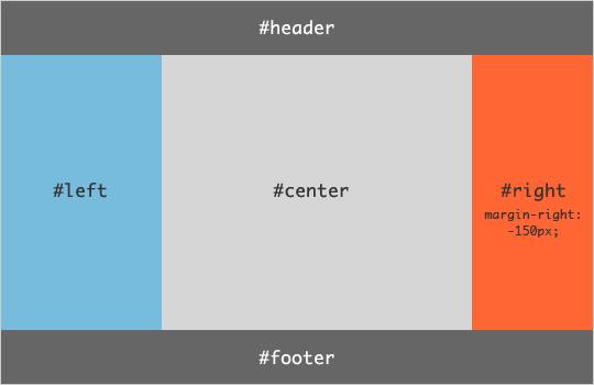
圣杯布局(Holy Grail Layout)指的是一种最常见的网站布局。页面从上到下,分成三个部分:头部(header),躯干(body),尾部(footer)。其中躯干又水平分成三栏,从左到右为:导航、主栏、副栏。
每行的项目数固定,会自动分行。